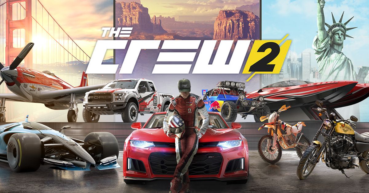
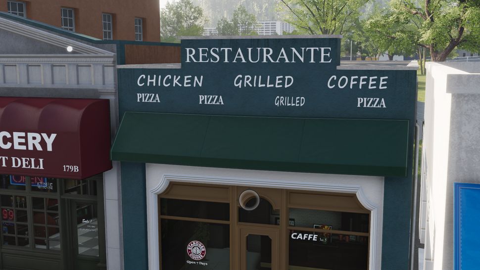
In the first The Crew game, everything felt alive and entertaining to look at while driving around. You could just randomly place a waypoint anywhere in the map for any reason and just enjoy the ride watching the buildings pass by and seeing the stores and signs imagining stories of how this world came to be what it is today, much like a real road trip, watching the world go by through the windows.
- The Stores and the World.
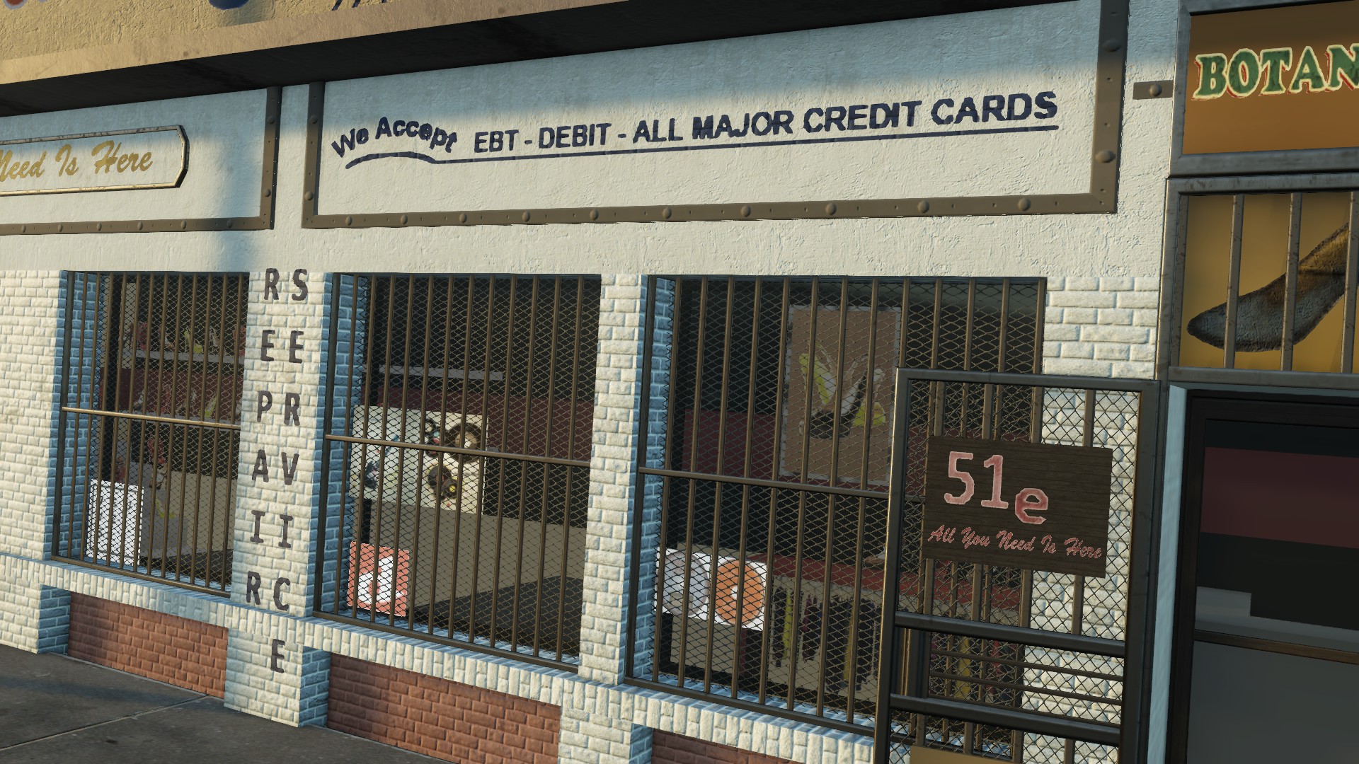
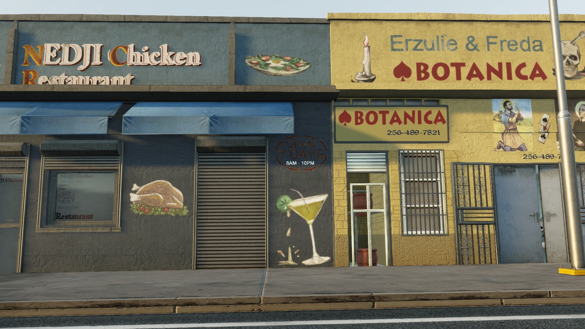 The Crew (2014/2015).
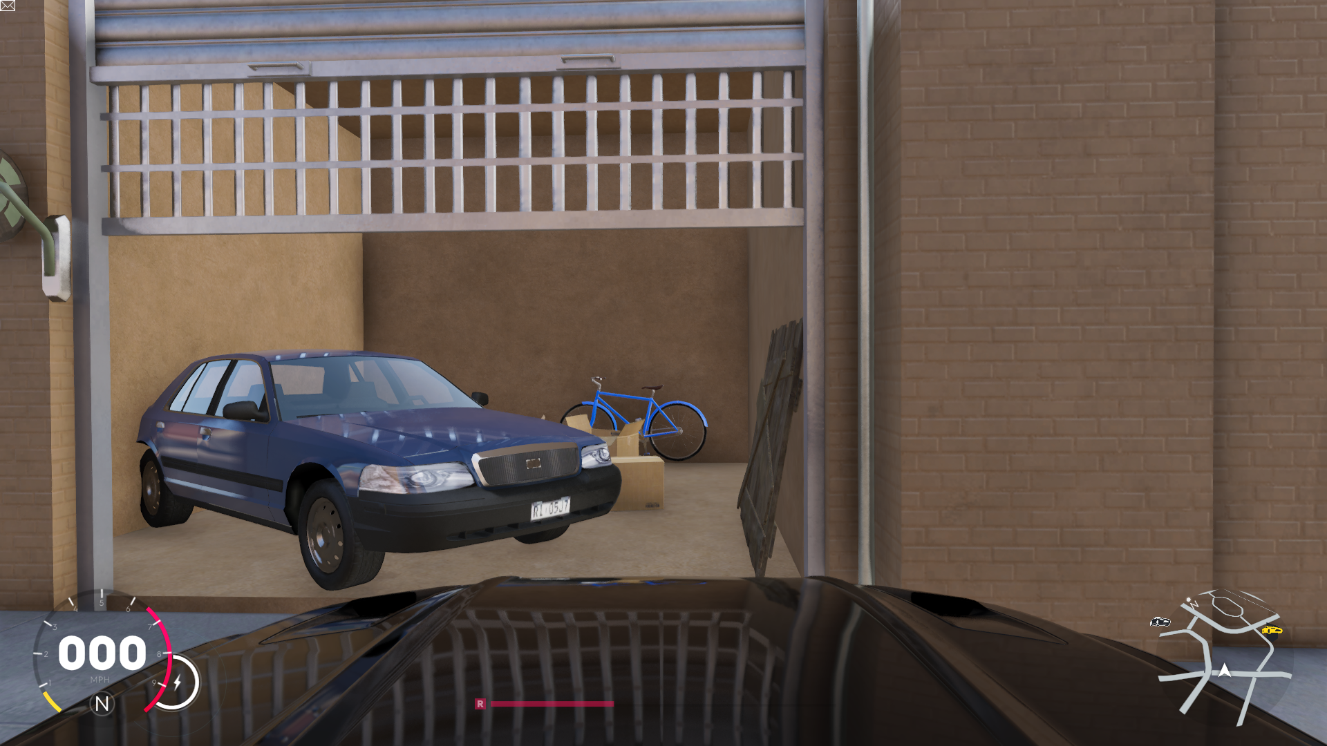
- The Speedometer HUD.
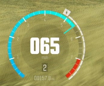
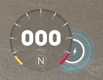
The Crew 2 Speedometer, with a huge circle to the side of the speedometer, using extra screen space for no reason.
- The Menu design and overall UI and HUD design.


They did this weird thing where most icons have a huge solid color box behind them which sometimes makes it harder to actually see the text (Like Yellow on White) and sometimes just makes everything look somewhat unprofessional. Not to mention the way the menu uses negative space, the menu is stuck on a letterbox mode that seems completely useless, the orange scribbles highlight the areas not being used by the menu, why put a huge white box on the top and bottom of the screen at all when they are only being used by 2 buttons. Or having the menu white box buttons be so huge.
Browsing through decals and liveries is also a mess because the Filter option does not work as advertised and the game doesn't have the categories the first game used to have where every decal is separated into types, the response time of the menu itself is also much slower having to wait seconds for each decal to load which didn't happen in the first game either. The game did add an amazing custom livery option that allows players to create custom decals and upload them into the game itself how ever, but finding good ones can take up several minutes of loading times overall.
The game gives random items for the player, but limits the inventory size and allows for lower level items to drop which are useless, the player can scrap those items for no reward only to free up space which brings up the question "Why even have a limited inventory space at all?" and "Why not allow for Mass-Scrap buttons instead of individually holding the button down for each item". All these things are "Quality Of Life" features that the game severally lacks.
- The awful, awful draw distance.
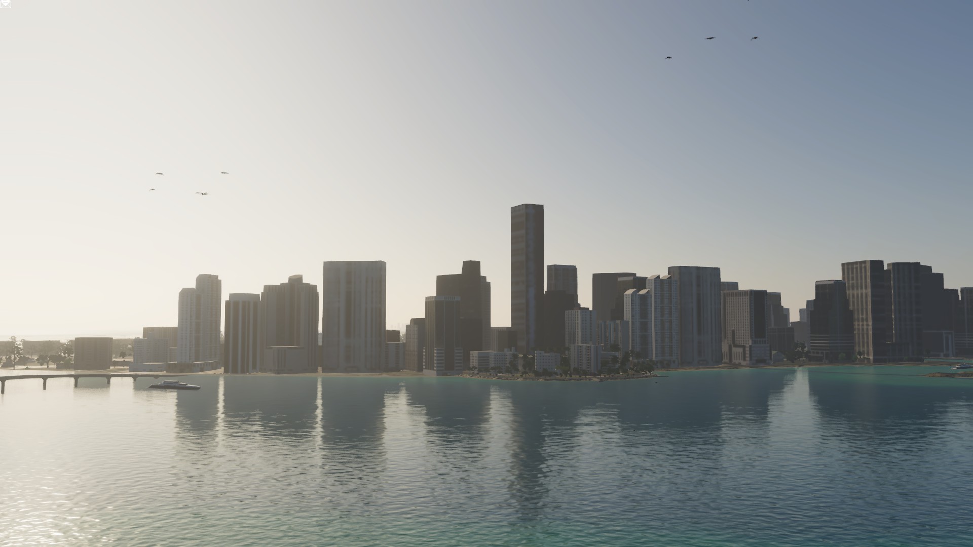

By far the most appalling part of The Crew 2, the draw distance manages to rival that of GTA San Andreas on the Playstation 2 (Released in 2004) with buildings walls and roads blurred and almost entirely untextured, even in places designed as "Vistas" where the player can look out of a window or bridge you can easily see these issues, you would think a balcony specifically pointing at these buildings would be made with a little more care.


- Lack of Content Quantity.
- There is only 1 single mission in the whole game where you race other motorcycles, even tho you can use a motorcycle on any Street race it seems odd to only have the AI use it once if at all.
- There is also only 1 single 40+ minute long mission in the game, people used to love the long road trip drives across country in the previous game. Other disciplines also have very few races between them like Hyper Cars and Touring for example.
- The game removed Exploration Landmarks entirely from the game which was used as a main method of progression and playstyle for many in the previous game, and it also removed the Collectible Car that was once spread around the world and replaced with gear-item lootboxes.
- After reaching max level you are rewarded items, but only once every 10 levels and only 1 single random gear type item.
- The game also does not allow for any customization in some cars like Touring Vehicles, the player cannot change bumpers or other customization options available for other car types, only rims and break colors.
- Not to mention some issues with drag racing like allowing for Crew Members to gain speed by Dragging of each other which screws up the leaderboard times for solo players and also not adjusting the gear shift correctly which ends up creating a scenario where getting a "Good" score instead of a "Perfect" score on gear shifts is actually faster during Drag Races.
Overall the game seems like a rushed and incomplete mess, entirely possible due to publisher pressure or any other reason but a rushed and incomplete mess none the less. It's also possible they intend on fixing these issues and adding more car options and missions with upcoming DLCs which would be nice but how ever will not suddenly change the fact that the game's release was disappointing.


